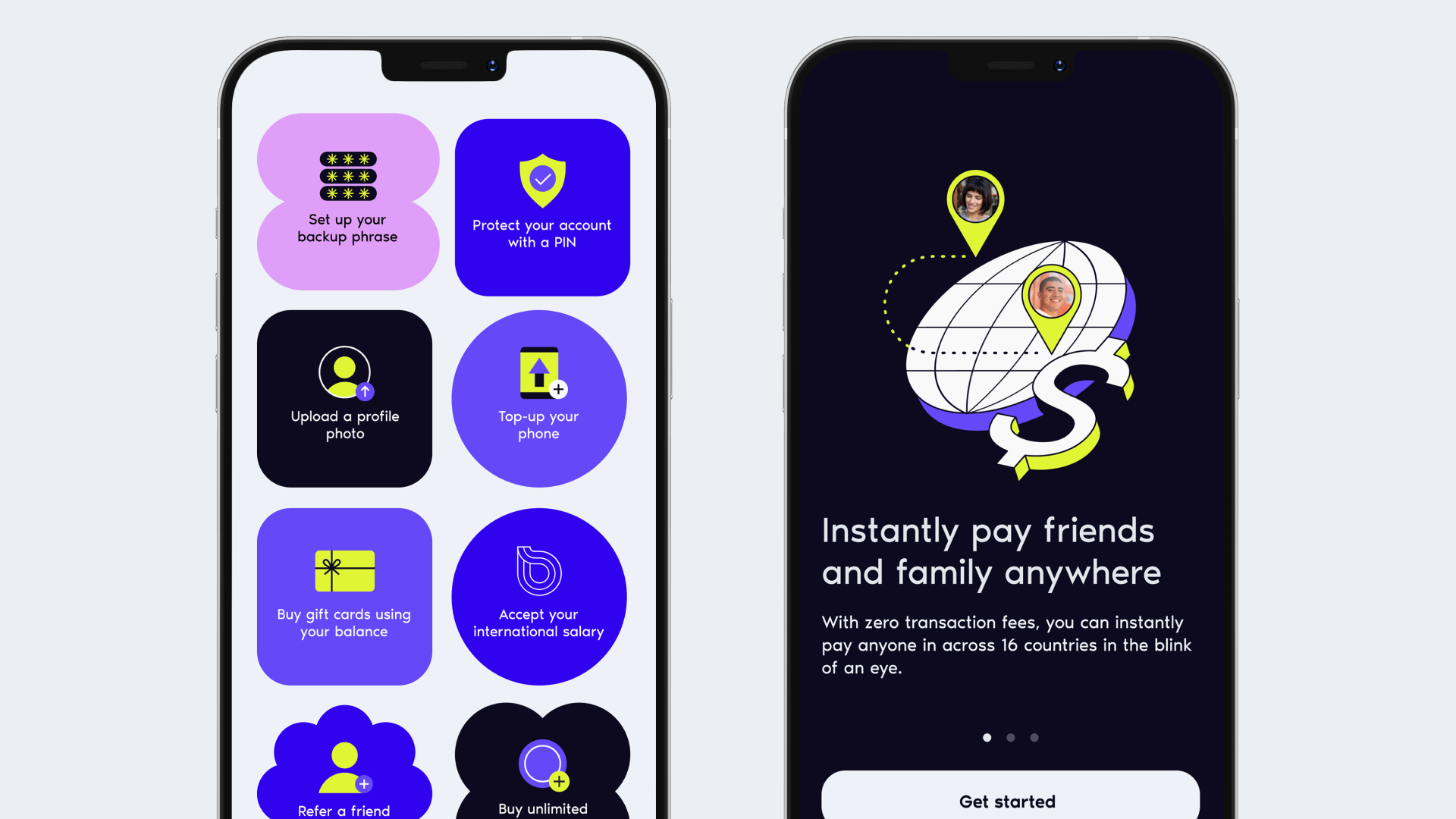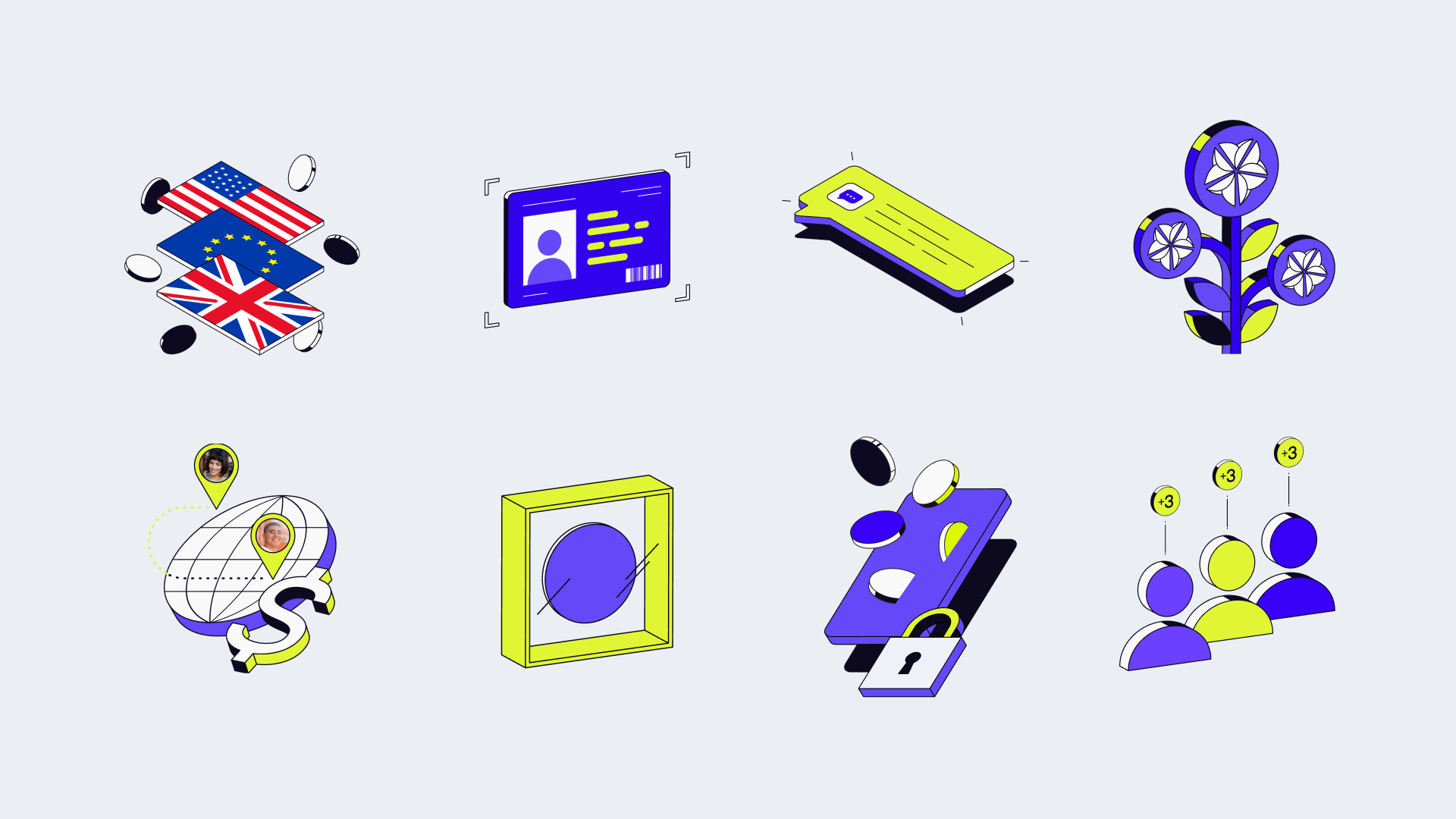
Evolving Visual Storytelling
As the main visual designer behind the brand for five years, I helped shape Vibrant’s visual language from the ground up. Originally launched as a digital wallet for users in Argentina, the brand evolved alongside the company’s growth. We focused on creating a simple, trustworthy experience with visuals that reflected core themes like sending money, everyday transactions, and financial ease.
First Iteration
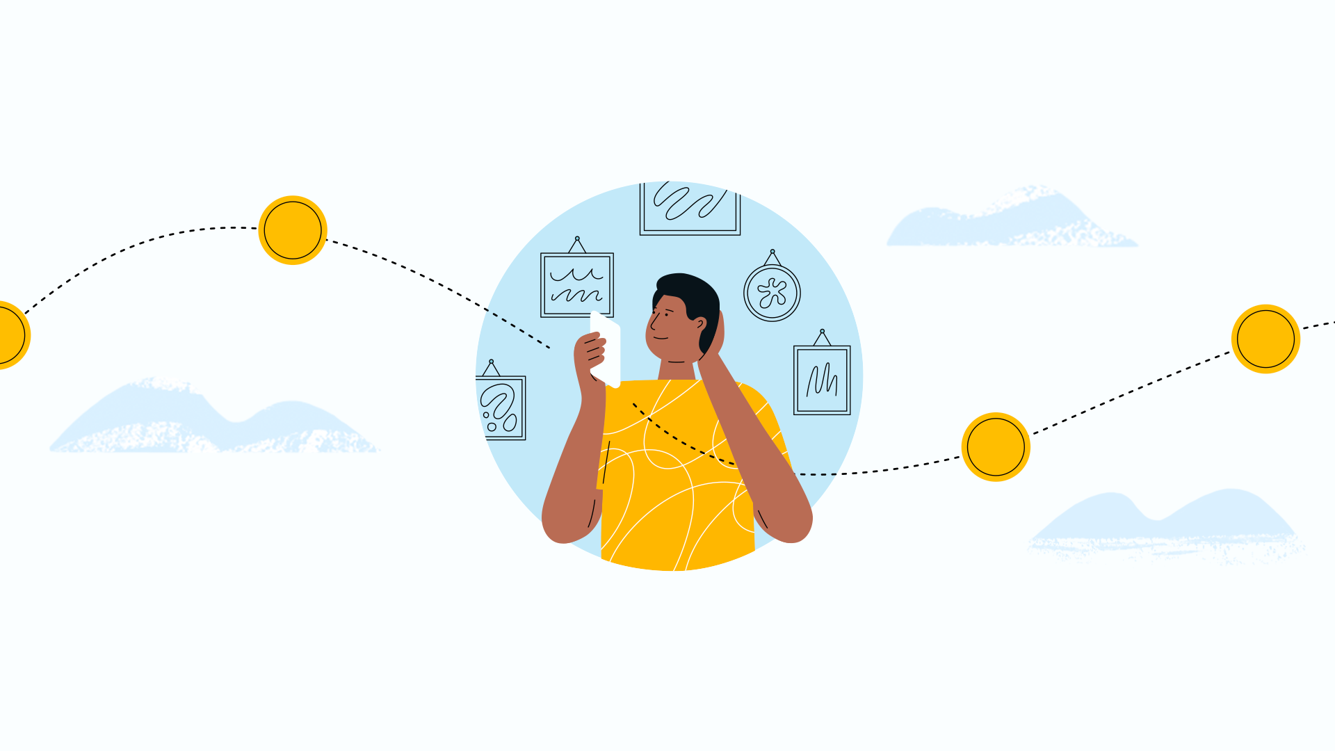
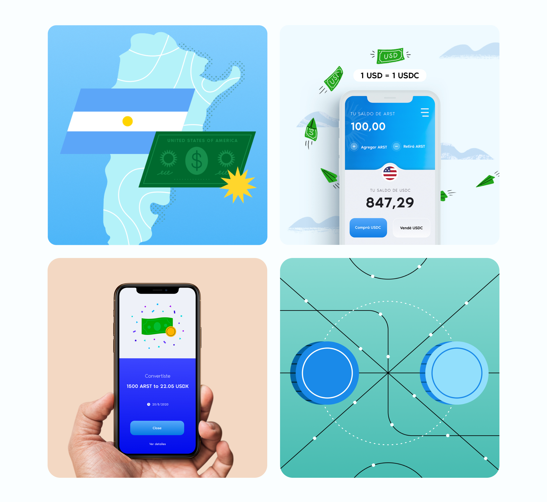
It was a race to get something to market from the beginning, so I chose a friendly and universal 2D illustration style that was approachable and quick to execute. Early versions also included hand drawn elements to add warmth and personality.
Designing for Argentina posed a unique challenge. With a population deeply distrustful of government and banks due to decades of financial instability, I needed to develop a visual style that felt approachable and easy to understand.


Second Iteration
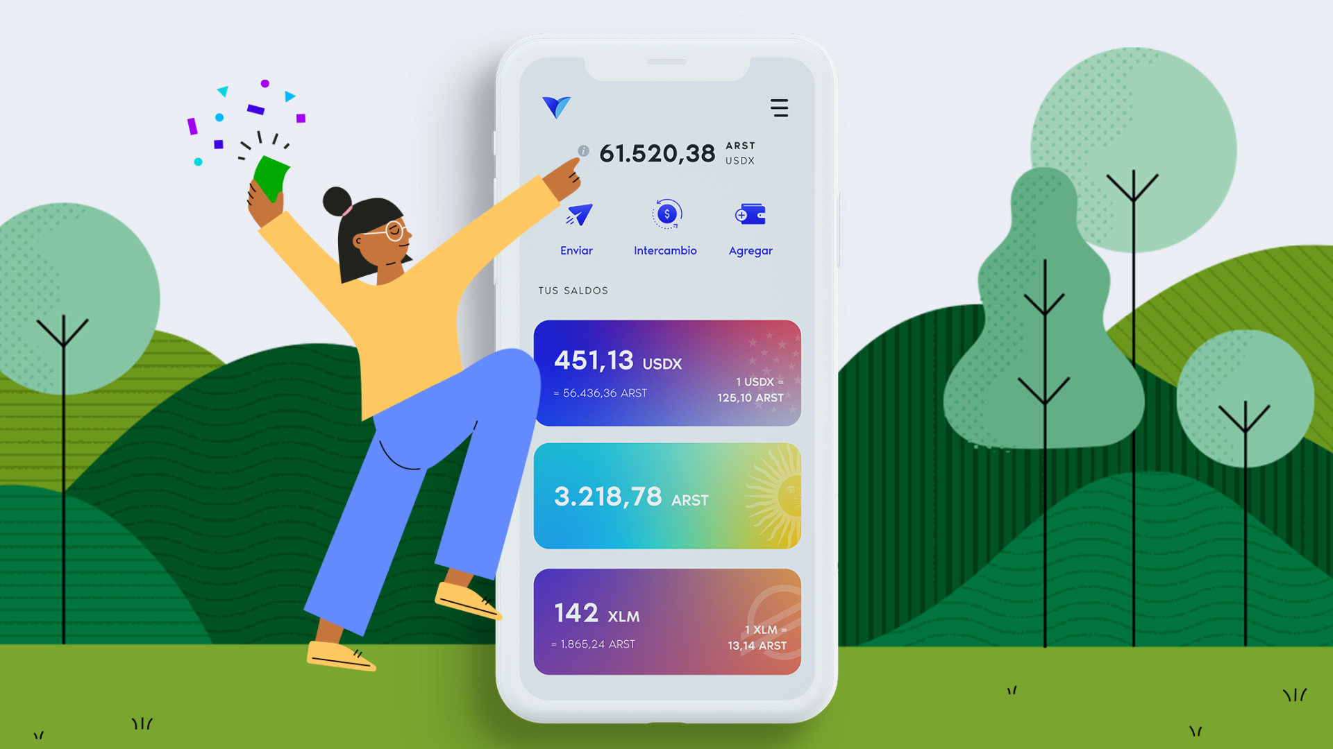
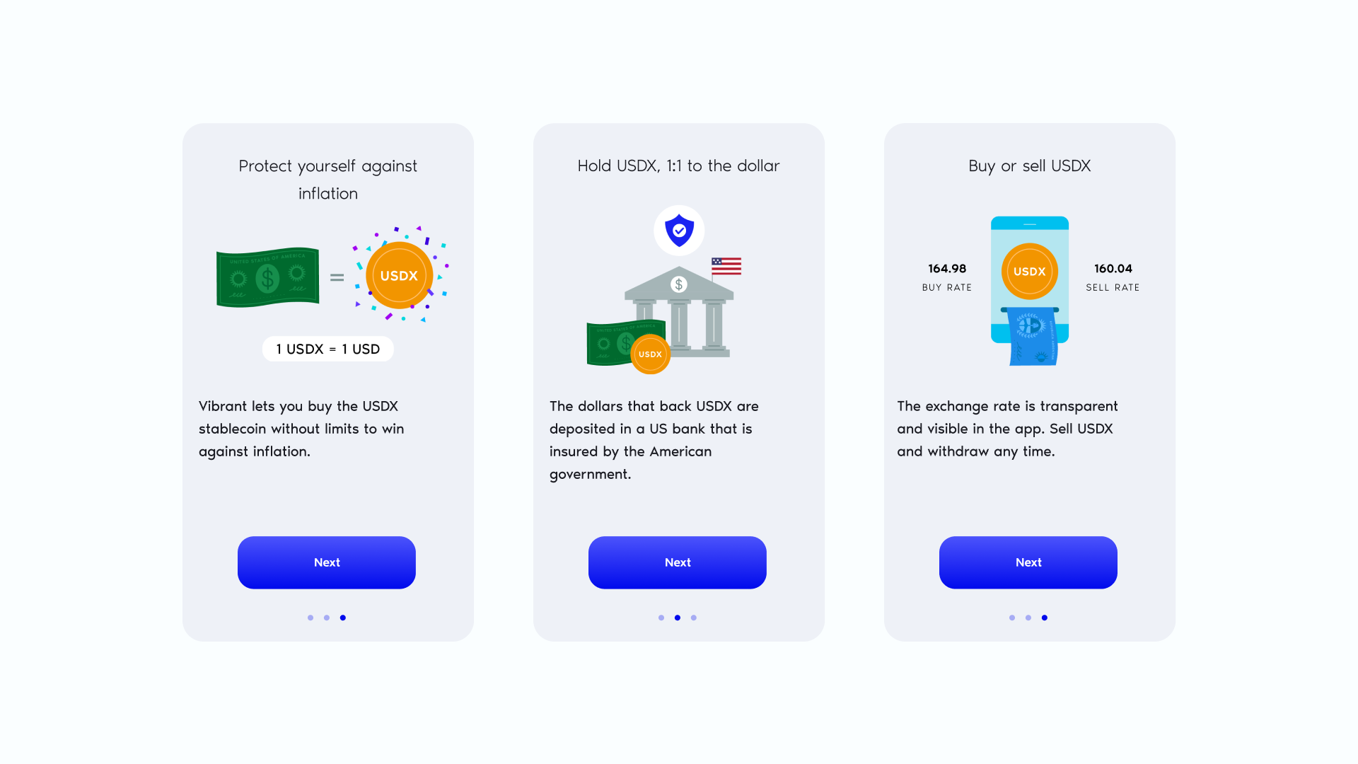
For the next iteration, I leaned into textured elements to bring more warmth and personality to the illustrations. This approach helped the visuals feel more human and expressive, moving away from the flat style of the early days. It was an opportunity to create moments of delight while still keeping the experience clear and approachable.




Third Iteration
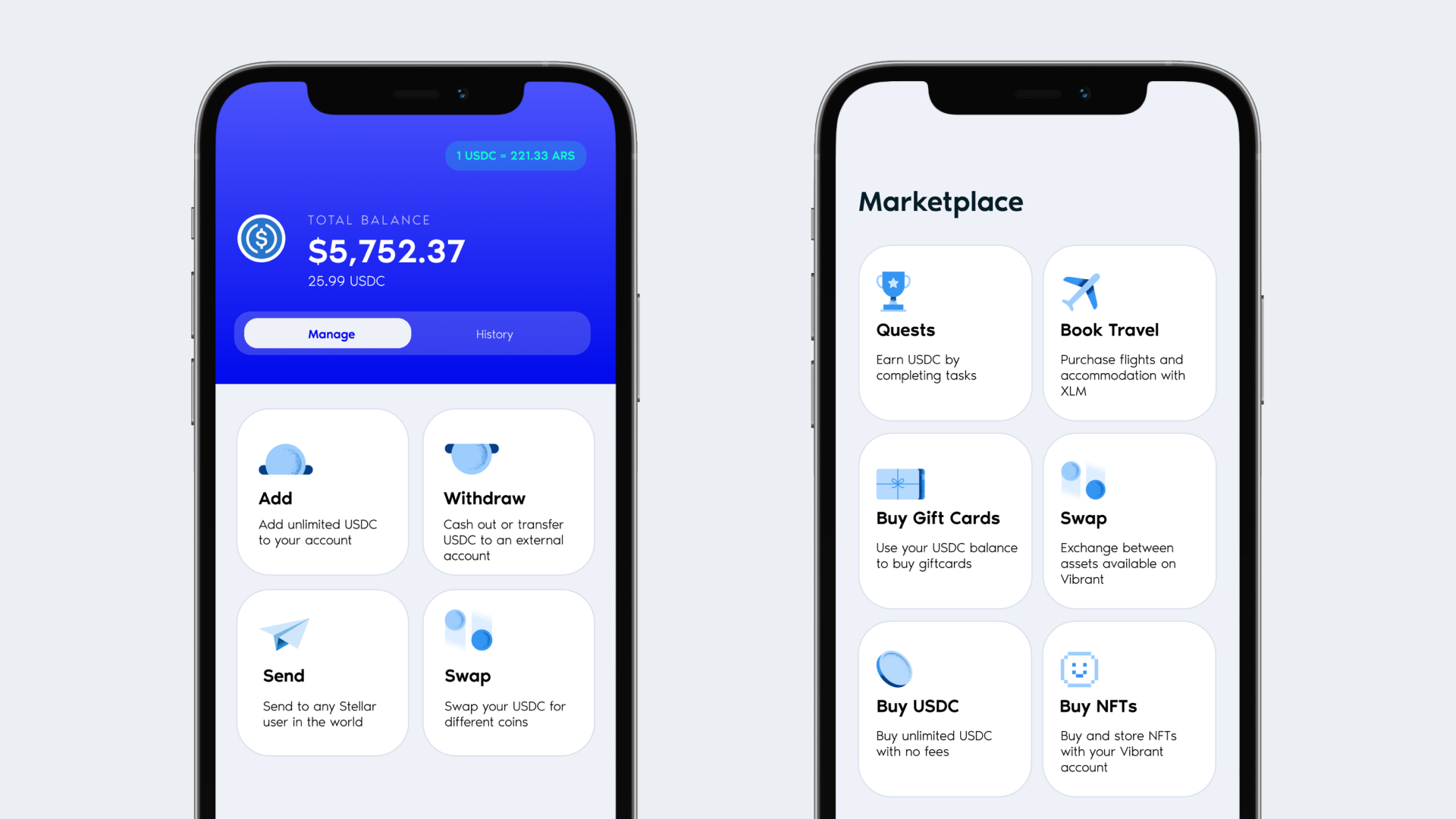
As the brand went through its final style iteration, I explored an isometric illustration style to align more closely with the visual language of the web3 and crypto space. The goal was to position the brand as more competitive and mature while still maintaining a look that felt approachable. The isometric perspective added structure and dimension without losing the personality we had built over time.

